Overview
This was an early-career project completed between 2015 and 2019. The focus was designing a Boolean search interface within a three-week timeline. This case study highlights my process and design decisions; detailed research data is no longer available.
Veritone's AI-powered media platform relied heavily on a search interface that had grown unwieldy. The existing search bar didn't support Boolean logic across all cognitive categories, offered no way to edit individual query terms, and cluttered limited space with icons, forcing users to reconstruct their entire search string whenever a change was needed.
The goal was to redesign the search experience to make complex queries fast, intuitive, and learnable, while maintaining the power media professionals relied on.
Project Team
Six people: Head of UX, two Project Managers, two Developers, and myself as Lead UX/UI Designer. Delivered in three weeks from research through engineering handoff.
The Problem
Users needed to build multi-criteria Boolean queries combining AND/OR/NOT operators across Veritone's cognitive categories such as transcription, face recognition, and object detection. The existing search interface made this nearly impossible:
- Users could not edit individual search terms, forcing them to retype the entire query for any change
- Boolean logic was only partially supported and limited to transcription, not across all engines
- Cognitive category icons cluttered the search bar and reduced usable input space
- The interface was overwhelming for average users and offered no guidance for constructing complex queries
- There was no way to save or reload search profiles for frequently repeated queries
Understand and Define
To begin the design process, I conducted interviews with stakeholders as well as internal and external users to better understand the problems the search UX/UI needed to solve. Questions focused on user goals, how they used the search function, pain points, needs, and workflow patterns.
This research helped align goals, prioritize features, and clarify workflow requirements. Based on these insights, a primary persona was created to guide design decisions.
Primary Persona: Victor Abbott
Victor represents the Customer Success persona, an expert-level Veritone user who constructs sophisticated, multi-variant search queries to manage client accounts and demonstrate platform value. His goals and frustrations directly informed the redesign priorities.
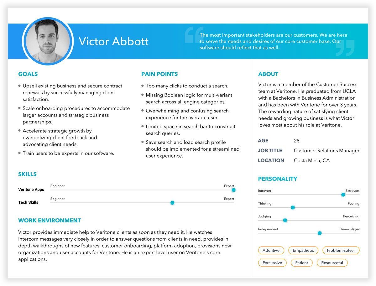
Victor Abbott: primary persona, Customer Relations Manager at Veritone
User Journey
Based on the research findings, a User Journey and Emotion Map was created to trace the search experience from arriving ready to search, to constructing a query, reviewing results, and attempting to refine it. The map clearly showed how quickly user sentiment dropped at the search query step and pinpointed where the interface caused the most frustration.
Key Journey Insights
- Ready to Search: Users arrived optimistic thinking "This is going to save me so much time," but the cluttered search bar immediately signaled complexity
- Search Query: Confidence collapsed as users couldn't find Boolean operators, didn't know what they could search across, and had no guidance on query construction
- Results: Frustration peaked with inaccurate results sending users back to support rather than refining the query themselves
- Modify Query: The breaking point occurred when any change required starting over, leaving users feeling "I have to start all over"
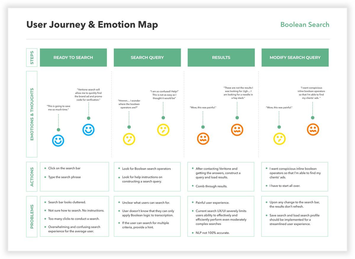
User journey and emotion map of the Boolean search experience, highlighting frustrations, actions, and opportunities to improve clarity, guidance, and efficiency
Wireframes and User Testing
Low-fidelity wireframes were created to map out the new search structure, interactions, and layouts. This helped communicate the UX/UI vision to developers, assess technical feasibility, and gather early feedback from stakeholders. Wireframes went through several rounds of iteration to refine the optimal user workflow.
Internal and external user testing validated the proposed search improvements. The three key usability enhancements below were tested, refined, and confirmed before moving into high-fidelity design.
Usability Improvement 1: Search Bar Redesign
The search bar interface was redesigned to create more usable space. Cognitive category icons were moved inside their respective input containers instead of the main search bar, freeing horizontal space and reducing visual clutter.
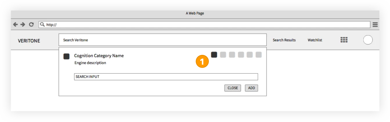
Search bar redesign with icons moved into inputs, reducing clutter and freeing space
Usability Improvement 2: Visual Boolean Logic
Users can now build advanced queries using AND/OR/NOT operators across all of Veritone's cognitive categories, not just transcription. This enabled more complex search strings and reduced the time spent manually filtering results.
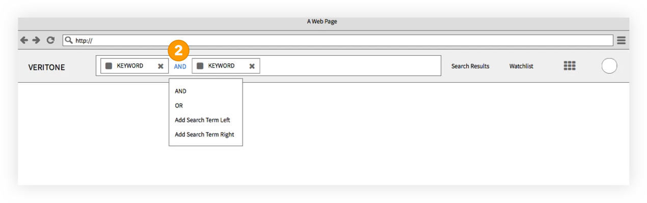
Visual Boolean logic enabling AND/OR query building across cognitive categories for faster, more flexible search
Usability Improvement 3: Search Pill Grouping
Search terms are displayed as individually editable pills that can be grouped to create complex, prioritized queries. Grouping pills allows users to set query priority and edit individual terms without reconstructing the entire search.
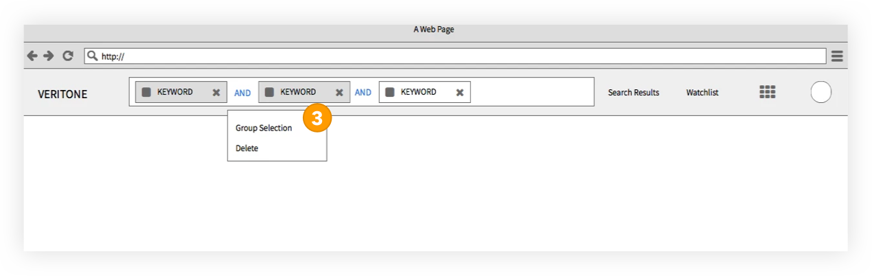
Grouped, editable search pills for flexible, prioritized queries without rebuilding
Solution
Three key changes solved the core problems. Cognitive category icons were moved out of the search bar and into their own input containers, freeing up query space. AND/OR/NOT Boolean operators were extended across all cognitive categories, allowing users to build searches the platform was already capable of. Search terms became individually editable pills that could be grouped to set query priority, letting users edit a single term without starting over. The result was a search experience that aligned with users' understanding of Boolean logic.
Sketch was used to design the new search UI, and InVision was used for pixel-perfect handoff to developers. Additional UX/UI interaction documentation highlighted specific behaviors, while Google's Material Design guidelines ensured a modern, consistent UI in line with Veritone's product direction.
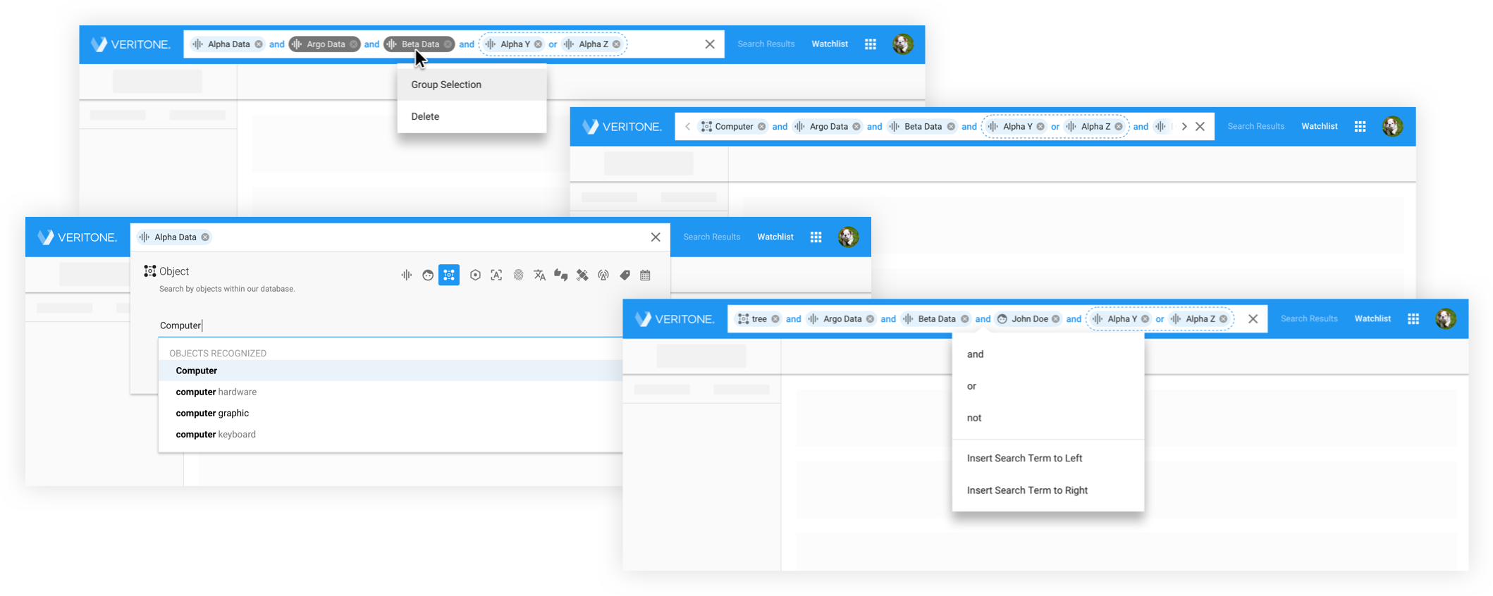
High-fidelity UI of the final Boolean search interface, designed in Sketch and delivered through InVision
Outcome
The full project including research, wireframes, testing, high-fidelity designs, and developer handoff was delivered within a tight three-week timeline. Close collaboration and clear communication across the six-person cross-functional team made this possible.
Redesigned search bar with editable pills for faster and easier query modification.
Users can build structured, prioritized multi-string queries using Boolean AND/OR/NOT logic and pill grouping.
Internal and external user testing demonstrated a clear reduction in time on task.